
B-Side Productions + Management
Services:
Brand Identity Refresh, Website Design + Build
Thematic:
Showcase, Structure and Scalability
Design Team:
Alex Waldu [Build], Katie Stamp [Design]
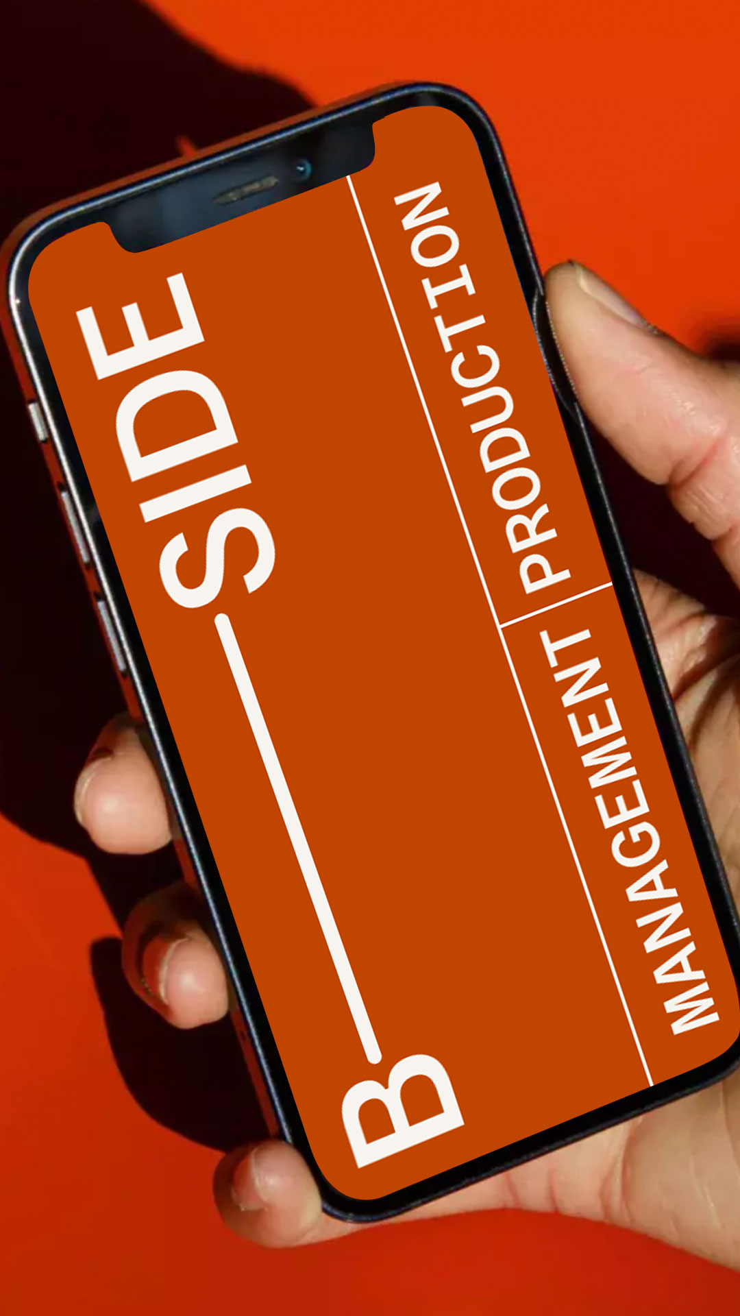
B-Side, a boutique production and talent management agency based in Soho, approached us to overhaul their website. Their previous site suffered from navigation difficulties, management challenges, and a disjointed brand identity for their two business arms: Production and Management. Our task was to unify the branding, streamline user experience, improve search filters, and enhance the digital showcase for the management side.
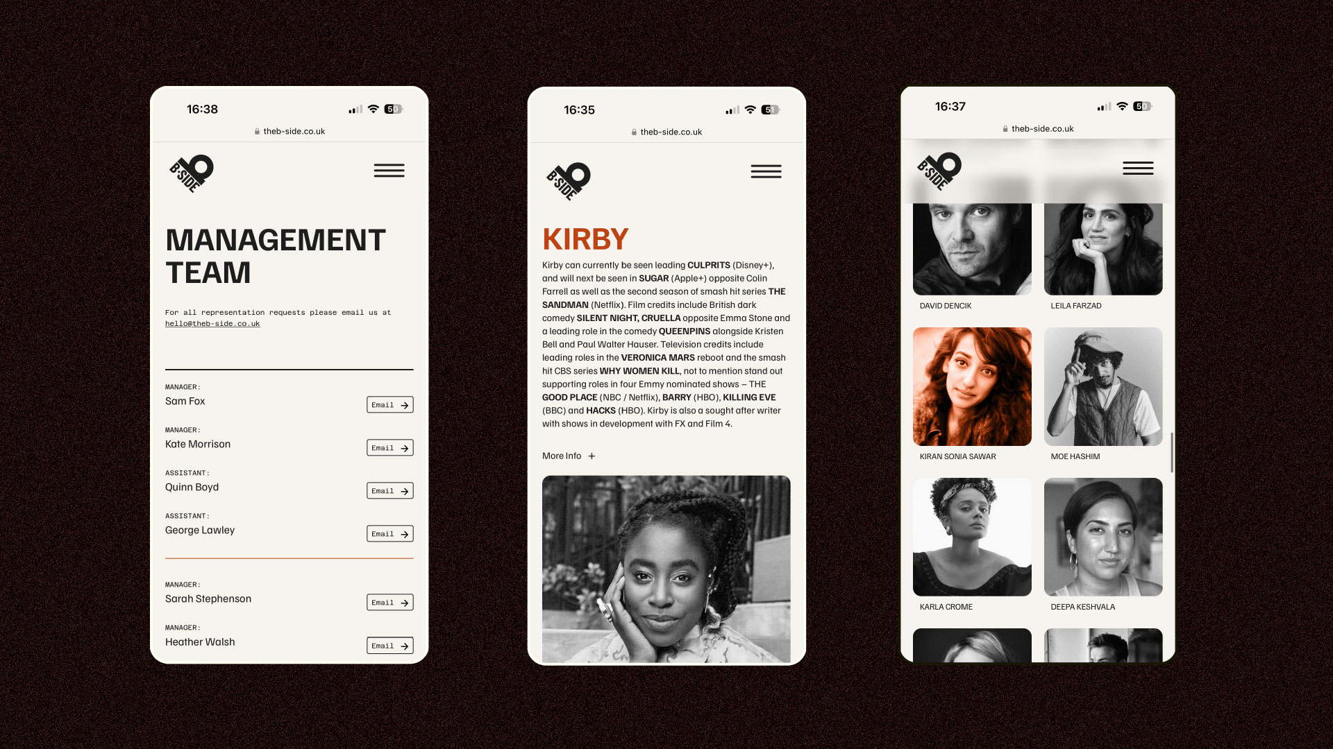
Our primary priority was enhancing the user experience by addressing the disjointed presentation of the two business arms on the homepage. We created a clear decision point for visitors—Production or Management—ensuring intuitive navigation throughout the site. Implementing a feature that loads the navigation upon page selection further enhances user exploration, preventing them from getting lost or confined within a single section.
Beyond site structure, we had to go back to basics and unify the logo into a single form, merging the previous two logos. Removing the texture, which was difficult to use within digital platforms, and fully embracing B-Side as a cohesive entity, to unify the business and create a clear visual language.

Drawing inspiration from editorial layout principles, we chose Familjen Grotesk for its clear legibility and character. We employed oversized title treatments and a modular grid system to showcase the talent profiles. Our flexible structure ensures that each profile reloads in a different part of the grid with each refresh, keeping the layout dynamic. Another significant aspect of the site build was our comprehensive search and filter tagging system, allowing users to focus their search on specific job titles or search by name.


As part of our commitment to our clients, we ensured the website's scalability and longevity. We provided B-Side with a platform that offers flexibility for future growth, allowing them to expand the grid system as they grow. Our focus was on combining style with structural integrity. The client desired a website where the team remains in the background, with the spotlight on the talent and productions they represent. By creating modular systems, we've empowered them with full control over future updates and the confidence to manage the backend efficiently. A website isn't just a quick fix, it's a long-term investment.
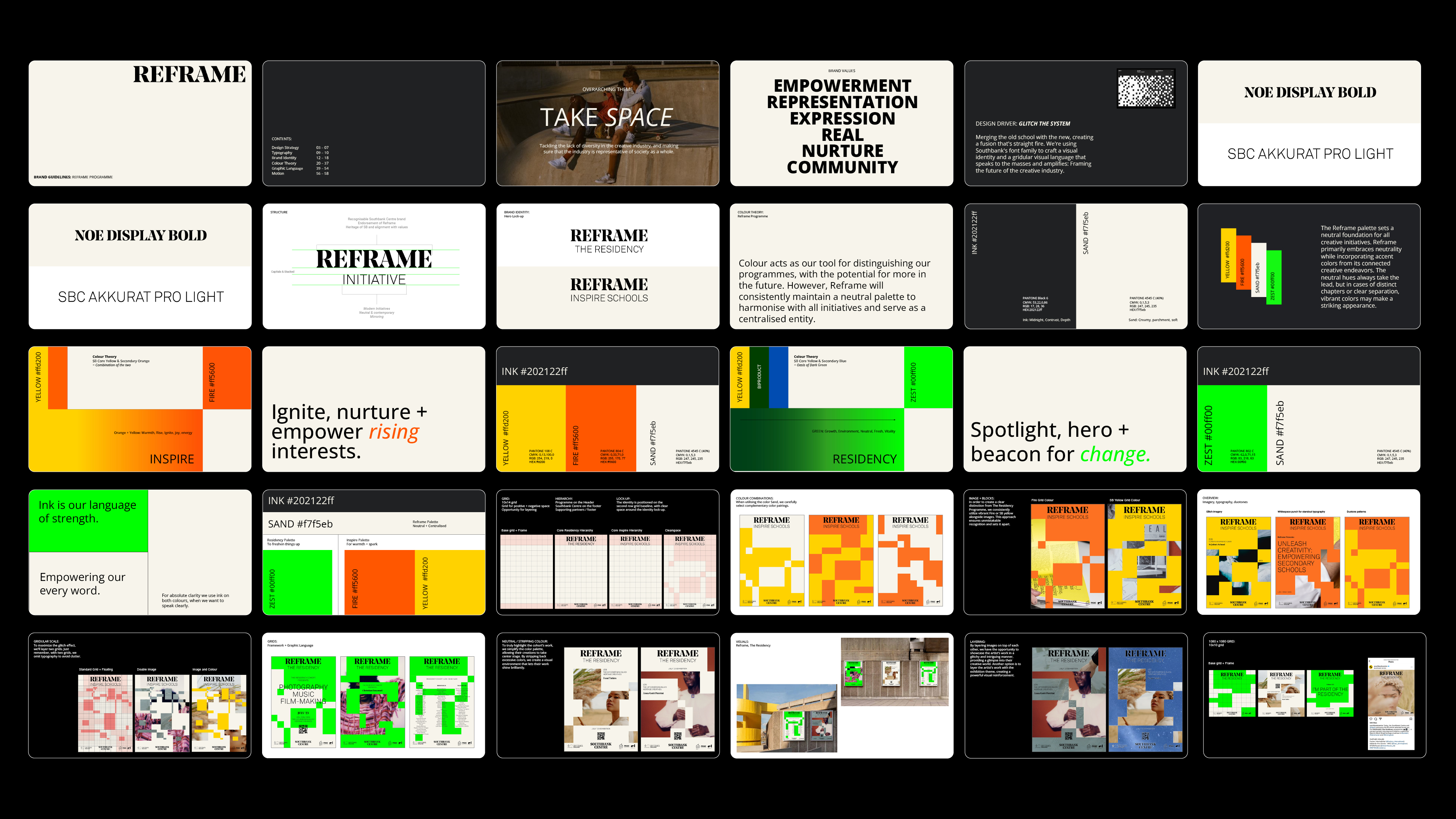
Southbank Centre: Reframe
Services:
Brand Identity, Exhibition Branding, Digital Assets
Thematic:
Addressing diversity gaps in the creative industry
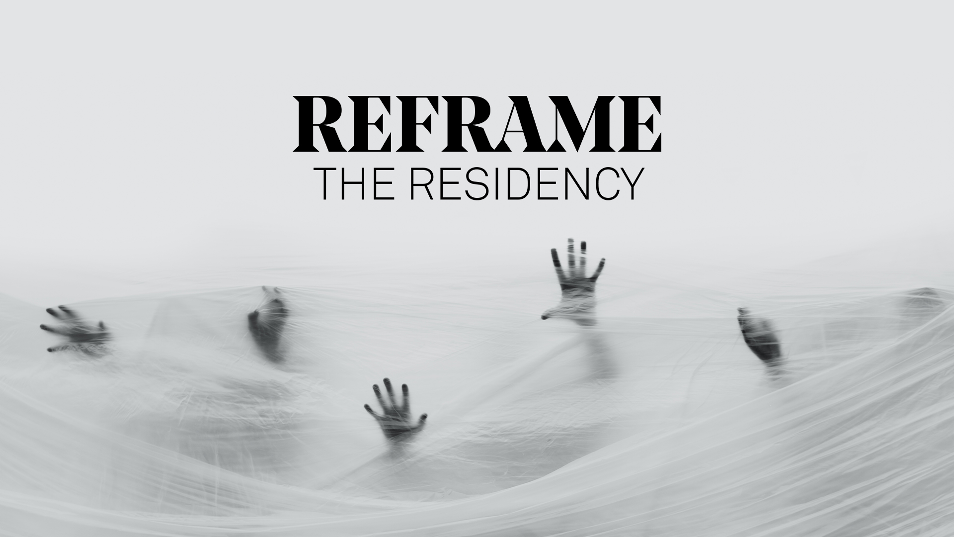
In collaboration with the Southbank Centre, The Reframe brand system and Residency exhibition aesthetic were meticulously crafted. The Residency, intrinsic to Reframe, propels the careers of young Black creatives—an initiative backed by Apple and executed with the Factory International, STEAMhouse, and Midlands Arts Centre. Beyond its foundational support, it stands as a dynamic spotlight for emerging talent in London, Birmingham, and Manchester.
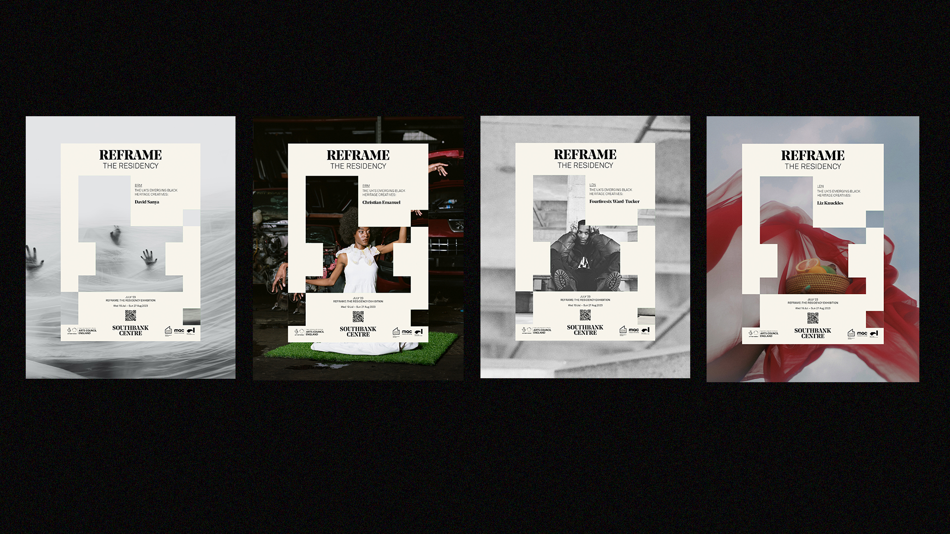
The digital exhibition seamlessly weaves together photography, music, and sound design, creating an impactful and immersive experience. Drawing inspiration from the theme of Climate Change, artists connect with their familial heritage in Africa, the Caribbean, and British urban landscapes, creating a narrative that resonates globally.


Our design driver: Gitch The System. Merging the old school with the new, creating a typographic fusion that's clear-cut. We used Southbank's font family to craft a visual identity and a gridular visual language that speaks to the masses, amplifying the future of the creative industry.
Colour acts as a tool to distinguish The Reframe programmes. Reframe itself will consistently maintain a neutral palette to harmonise with all initiatives and serve as a centralised entity. However, the vibrant green used in The Residency Exhibition embodies the energy and spotlight, creating a visual language that resonates with the ethos of breaking barriers and reshaping narratives.
Colour acts as a tool to distinguish The Reframe programmes. Reframe itself will consistently maintain a neutral palette to harmonise with all initiatives and serve as a centralised entity. However, the vibrant green used in The Residency Exhibition embodies the energy and spotlight, creating a visual language that resonates with the ethos of breaking barriers and reshaping narratives.


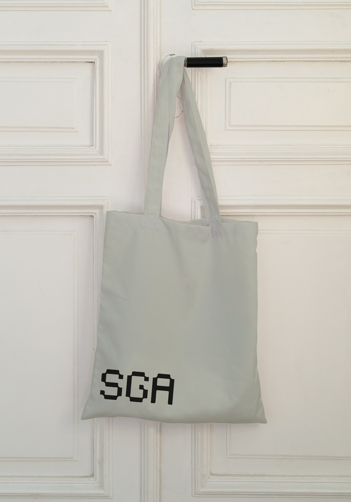
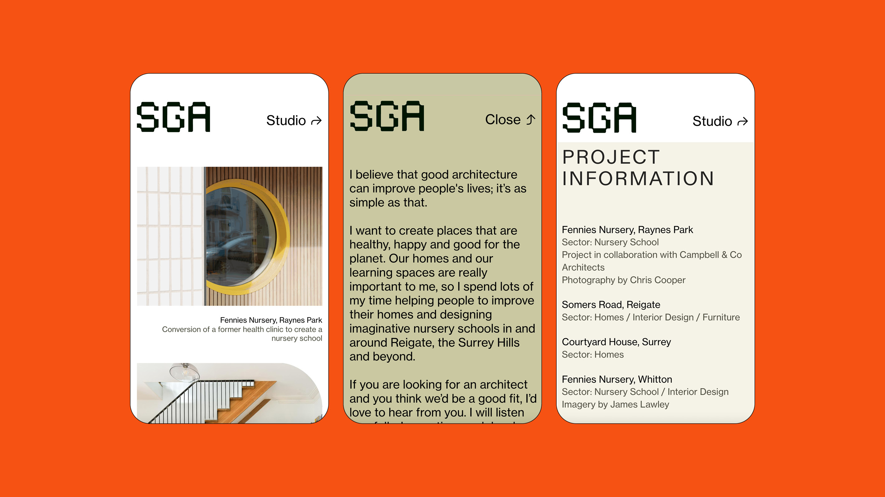
Sophie Griffiths Architects
Services:
Brand Strategy, Brand Identity, Website
Thematic:
Shape The Everyday
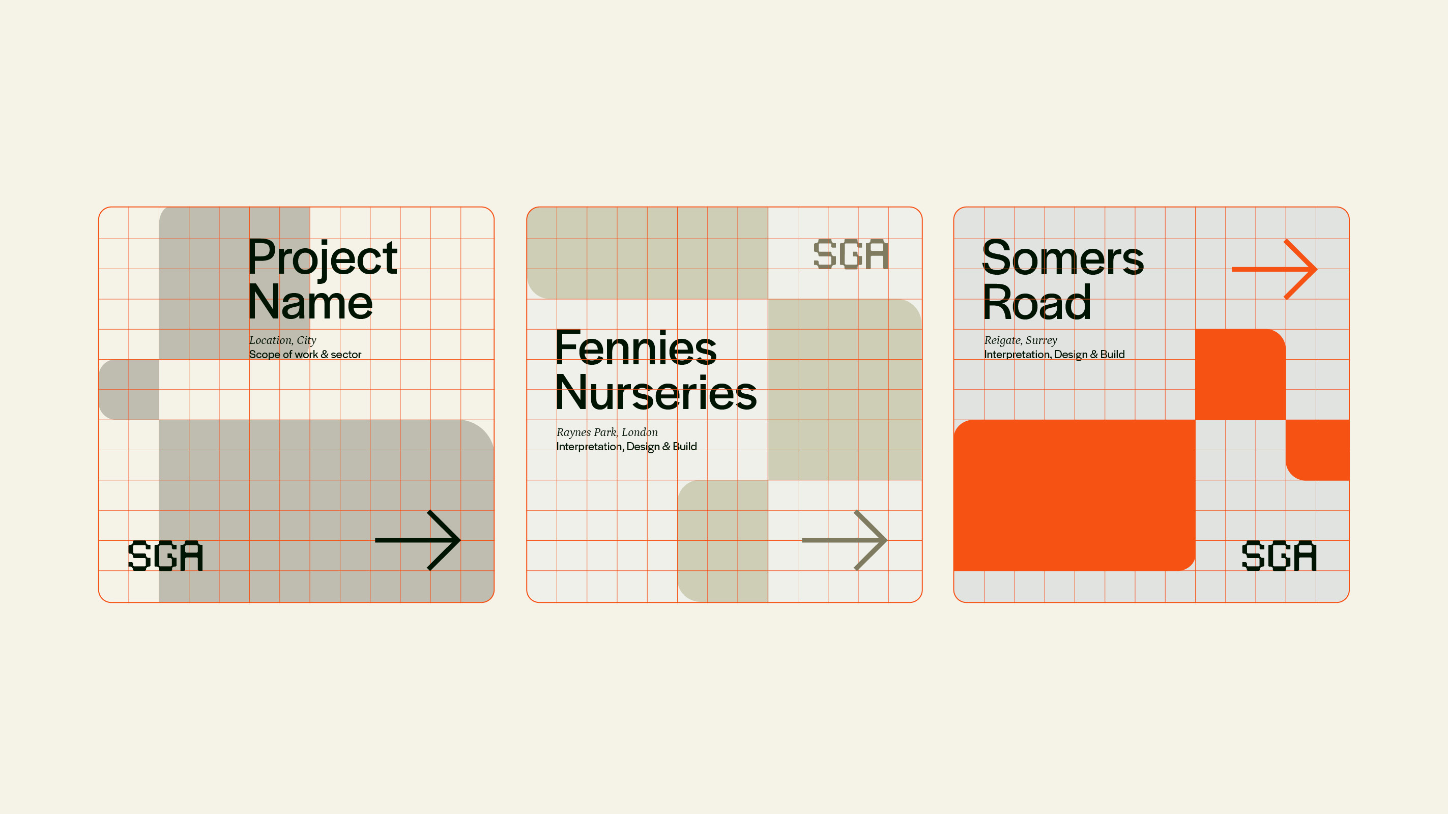
In an era where branding was once exclusively defined by the buildings designed, SGA sets a new standard for modern practice. Grounded in connection and process, Sophie sought a brand that authentically mirrored her design philosophy of fostering deep connections with businesses and individuals. Recognising the profound impact architecture can have on lives, she directs her focus to the places that shape our everyday experiences – our homes and learning spaces.
SGA's brand ethos revolves around seamlessly integrating art into everyday life. Serving as a creative bridge, Sophie focuses on providing clients with creative yet practical solutions for the day-to-day spaces. And this ethos is reflected in the visual language, where the brand's custom lettering, grid-based graphic language, and clear communication ensure that every aspect and detail is clear and proud. Waving the flag for good, honest design for everyone.


The choice of an earthy, tonal palette, influenced by Sophie's love for nature, harmoniously merges with a vibrant colour infusion, infusing dynamic energy into the SGA brand. This carefully curated palette not only brings the brand to life with fluidity and warmth but also introduces qualities often absent in the clinical world of architectural portfolios.
While the logo was designed to be both modern and modular, it seamlessly integrates across physical and digital touchpoints. Furthermore, the custom type influences the visual language and framework used within the website. Based on a simple cocktail of corner radius and a gridular layout, this brand remains grounded in functionality.
While the logo was designed to be both modern and modular, it seamlessly integrates across physical and digital touchpoints. Furthermore, the custom type influences the visual language and framework used within the website. Based on a simple cocktail of corner radius and a gridular layout, this brand remains grounded in functionality.


Youtube Black: Creator Celebration
Services:
Brand Identity, Merchandise, Digital Assets
Thematic:
“We Up” – Black voices and culture on a digital platform
Fostering unity through shared energy, #YouTubeBlack stands as the go-to space for creators passionate about black culture. It's more than just a platform; it's a canvas and a stage to amplify black narratives. From shaping brand positioning to concrete design principles, we seized the opportunity to construct an eclectic, optimistic, and vibrant visual realm that empowers.
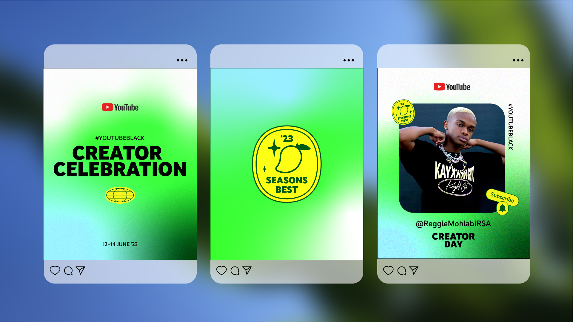
The Creator Celebration is a pivotal component of the #YouTubeBlack Voices Fund. Marking the final funding year, we were mindful of blending styles from both YouTube and the Voices Fund to ensure longevity as the channel grows. Hosted in Nairobi, Kenya, the Creator Celebration 2023 was not only about ensuring brand ownership but also embarking on a journey to infuse an African style and vibe. Driven by the “We Up” ethos, we crafted a series of positive messages to engage the community and highlight their outstanding work on the channel.


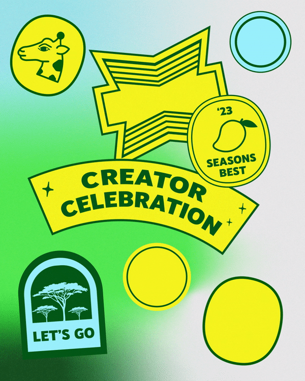

Drawing inspiration from fruit stickers and the African entrepreneurial spirit, we designed a series of collective stickers utilising YouTube's colour palette and typeface. They are not just analogue; they seamlessly work in the digital sphere, offering a simple yet engaging way to ensure brand consistency across the platform, social channels, and physical event collateral.
Another crucial part of the visual language is the gradient and image framing devices. This pays homage to the Black Voices Fund brand, with the gradient providing more of an organic feeling—a living gradient that animates across digital assets. It also allows freedom to change the tonal feeling, opting for darker colours with a pop of the complementary blue or a more monochromatic approach. The culmination is a brand that empowers individuals to share, play, dream, prove and inspire a world for tomorrow.
Another crucial part of the visual language is the gradient and image framing devices. This pays homage to the Black Voices Fund brand, with the gradient providing more of an organic feeling—a living gradient that animates across digital assets. It also allows freedom to change the tonal feeling, opting for darker colours with a pop of the complementary blue or a more monochromatic approach. The culmination is a brand that empowers individuals to share, play, dream, prove and inspire a world for tomorrow.


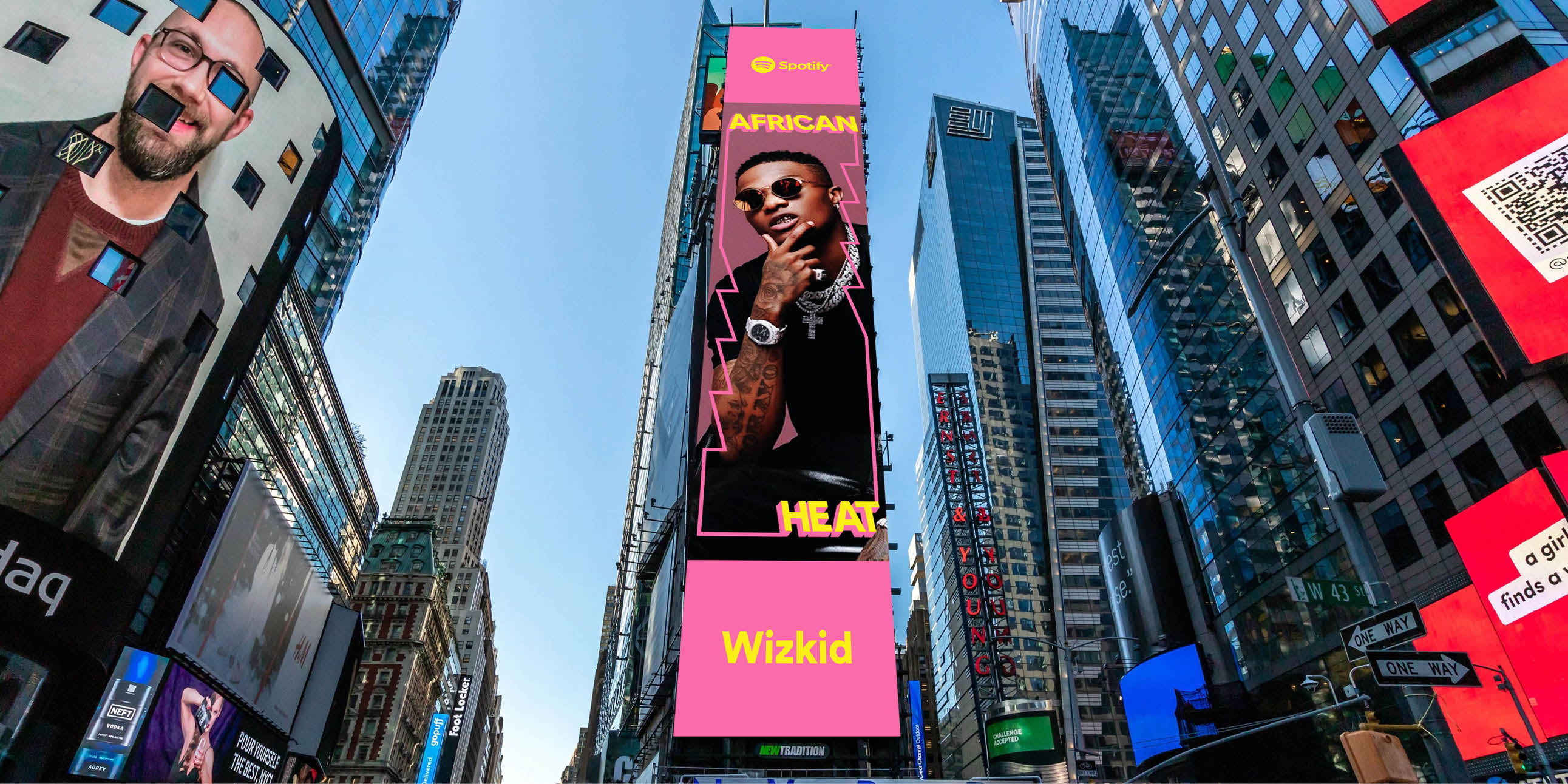
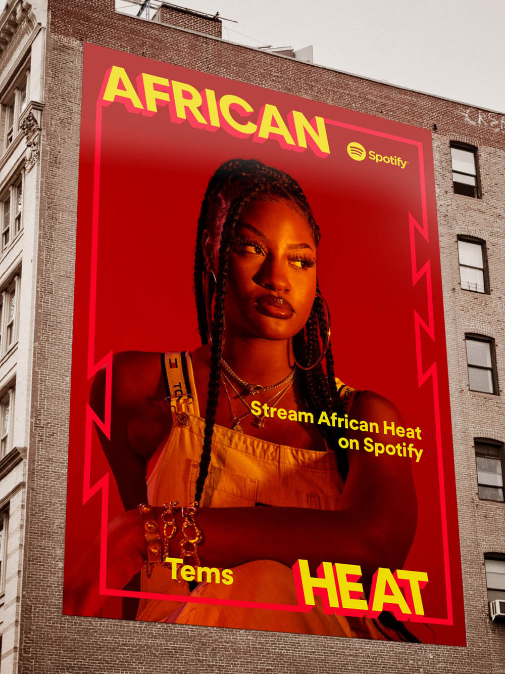
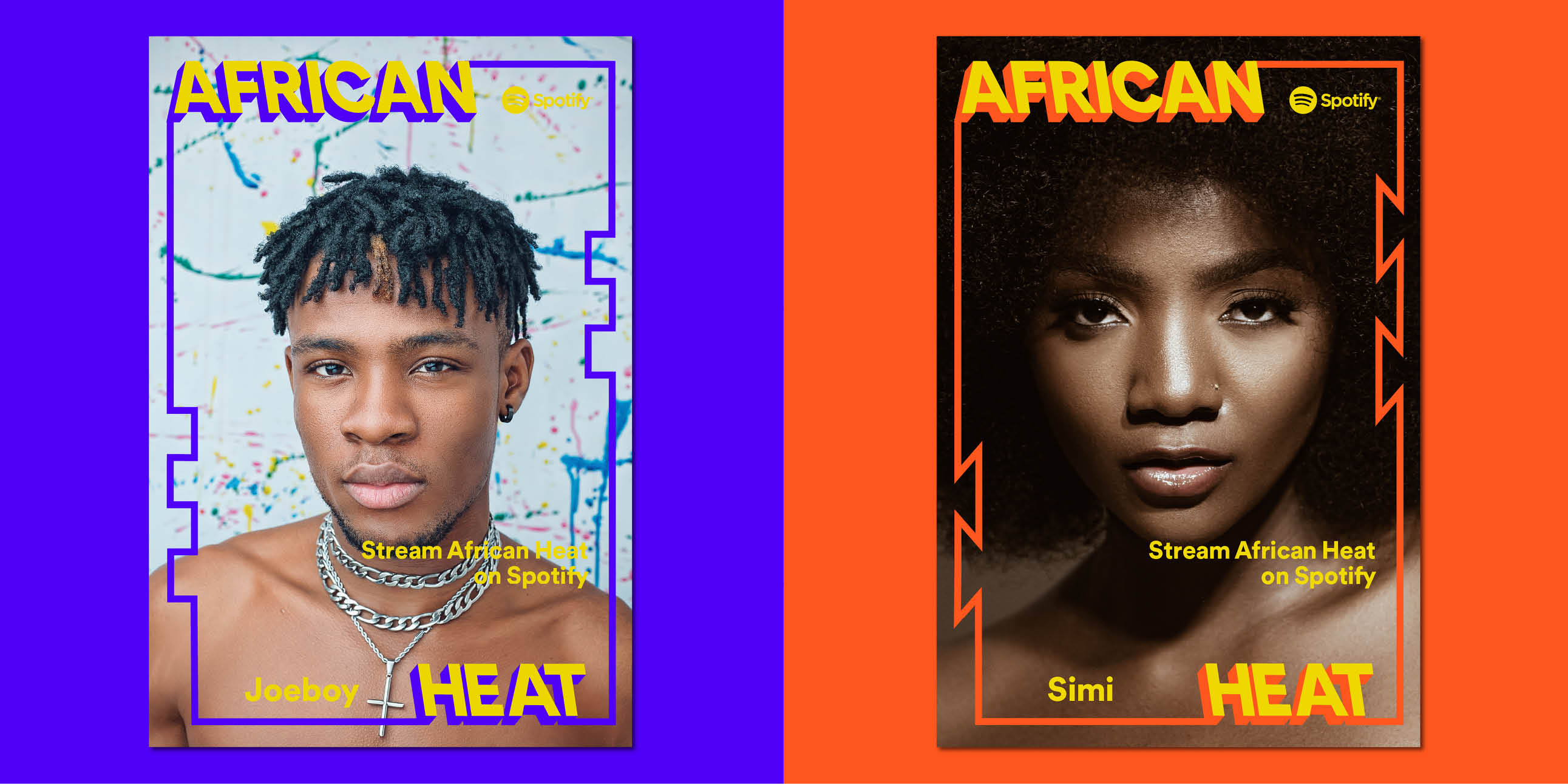
Spotify: African Heat
Services:
Brand Identity, Visual Language
Thematic:
The hottest new tracks from the continent
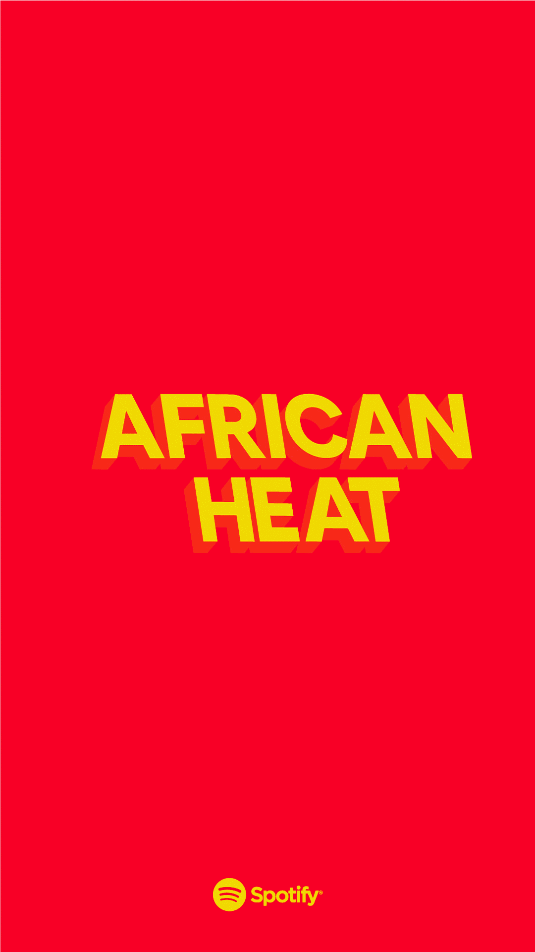
African music has surged globally across various genres, with curated playlists like Spotify's 'African Heat' playing a pivotal role. Spotify approached us to define the playlist's brand identity.
Channeling the rhythmic movement of music across the continent and beyond, the rebrand of the playlist takes inspiration from the artistry found in hand-painted signage and the vibrant visual culture of Africa. Working within Spotify's typeface and color palette limitations, we manipulated existing assets to introduce elements like drop shadows and paired color combinations, injecting some spice into the overall composition.


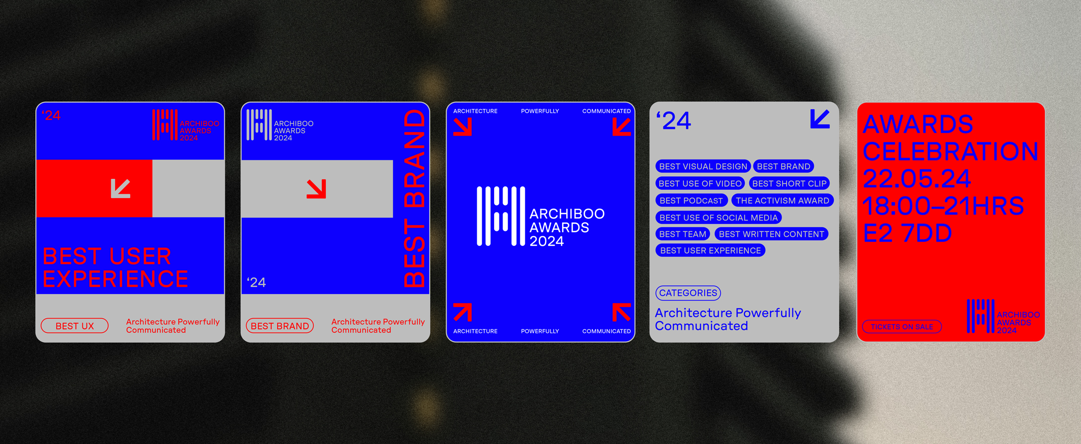
Archiboo Awards
Services:
Rebrand, Awards ‘24 Communication, Digital Assets
Thematic:
Architecture Powerfully Communicated
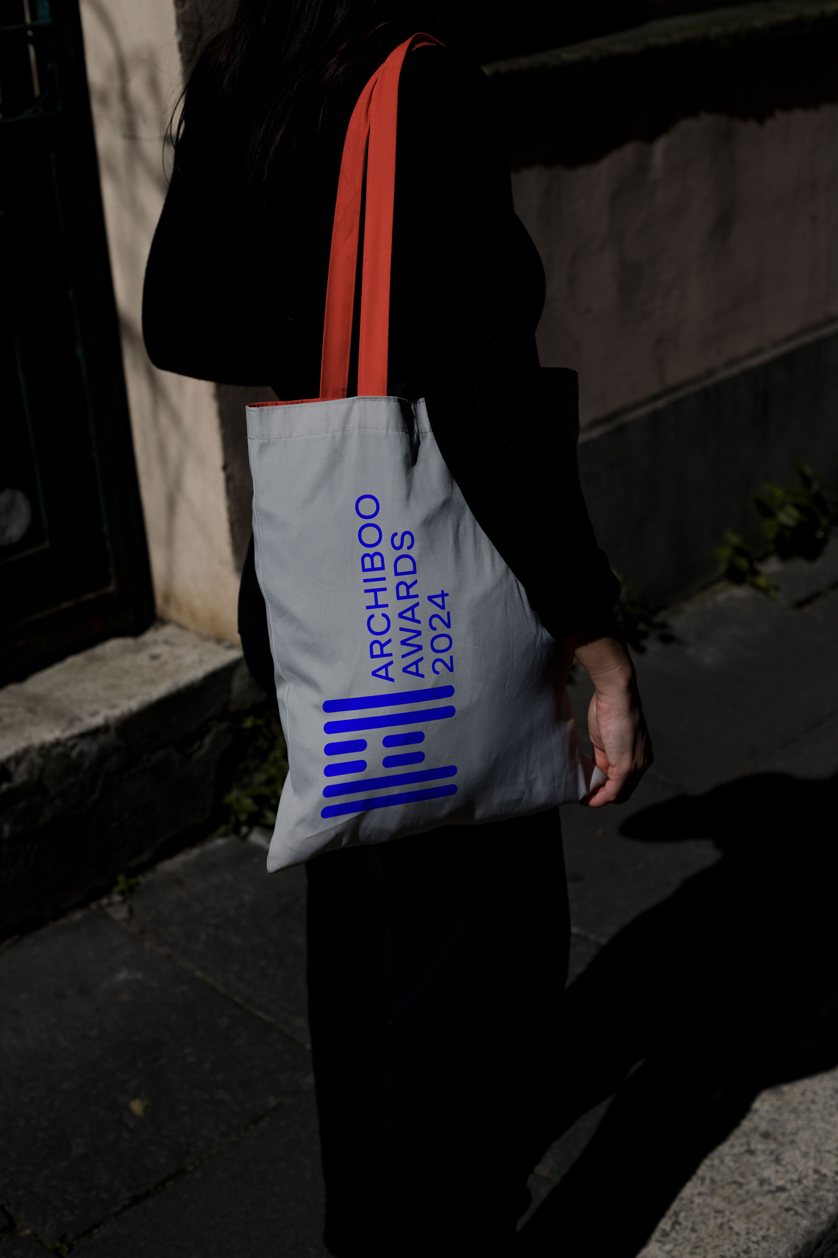
Archiboo is a platform dedicated to exploring and enriching the understanding of the built environment through events, awards, and content. In 2016, the Archiboo Awards were launched to celebrate communication innovation, underscoring the importance of digital storytelling and brand building for architects. We worked closely with founder Amanda Baillieu, embarking on a journey to redefine the Awards identity.
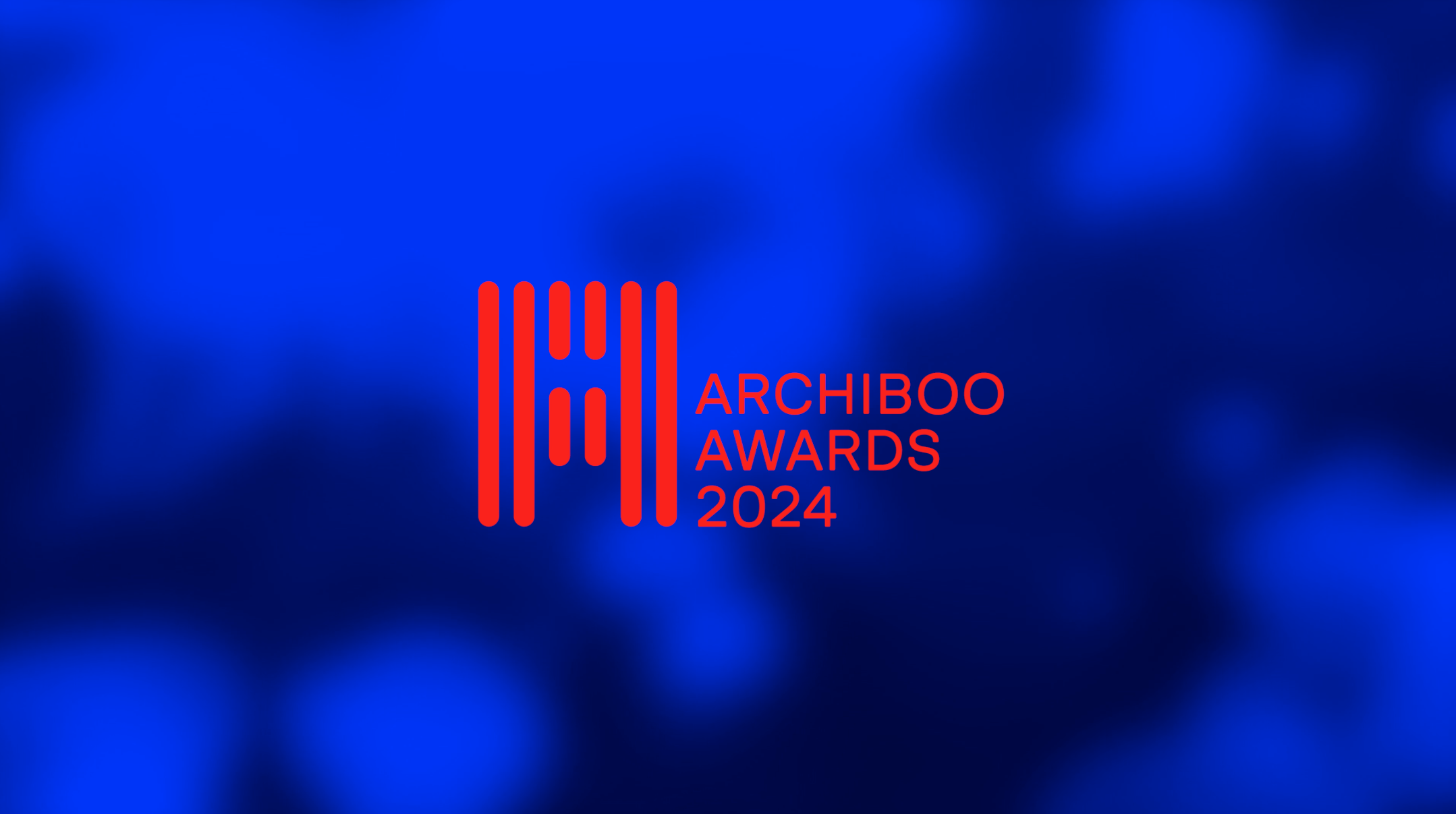
We identified untapped potential in key elements of the Archiboo brand – the distinctive blue palette, rounded custom wordmark, and underscore. A significant challenge faced by the Awards was the lack of a distinct identity, heavily relying on category graphics to engage audiences. It became evident that our objective was twofold: to align the Awards with the Archiboo family and to build a creative identity centred around a stronger mission and attitude – Architecture Powerfully Communicated

Drawing from existing assets, the underscore emerged as a pivotal component, providing a structural foundation and backbone of our identity and visual language. Complemented by GT Pressura Extended, selected for its similarities to the existing Archiboo wordmark, yet offering a contemporary and timeless appeal.
Furthermore, colour played a crucial role in enriching the brand. By introducing shades of grey and red alongside the signature blue, we infused the Awards brand with a more versatile foundation for growth

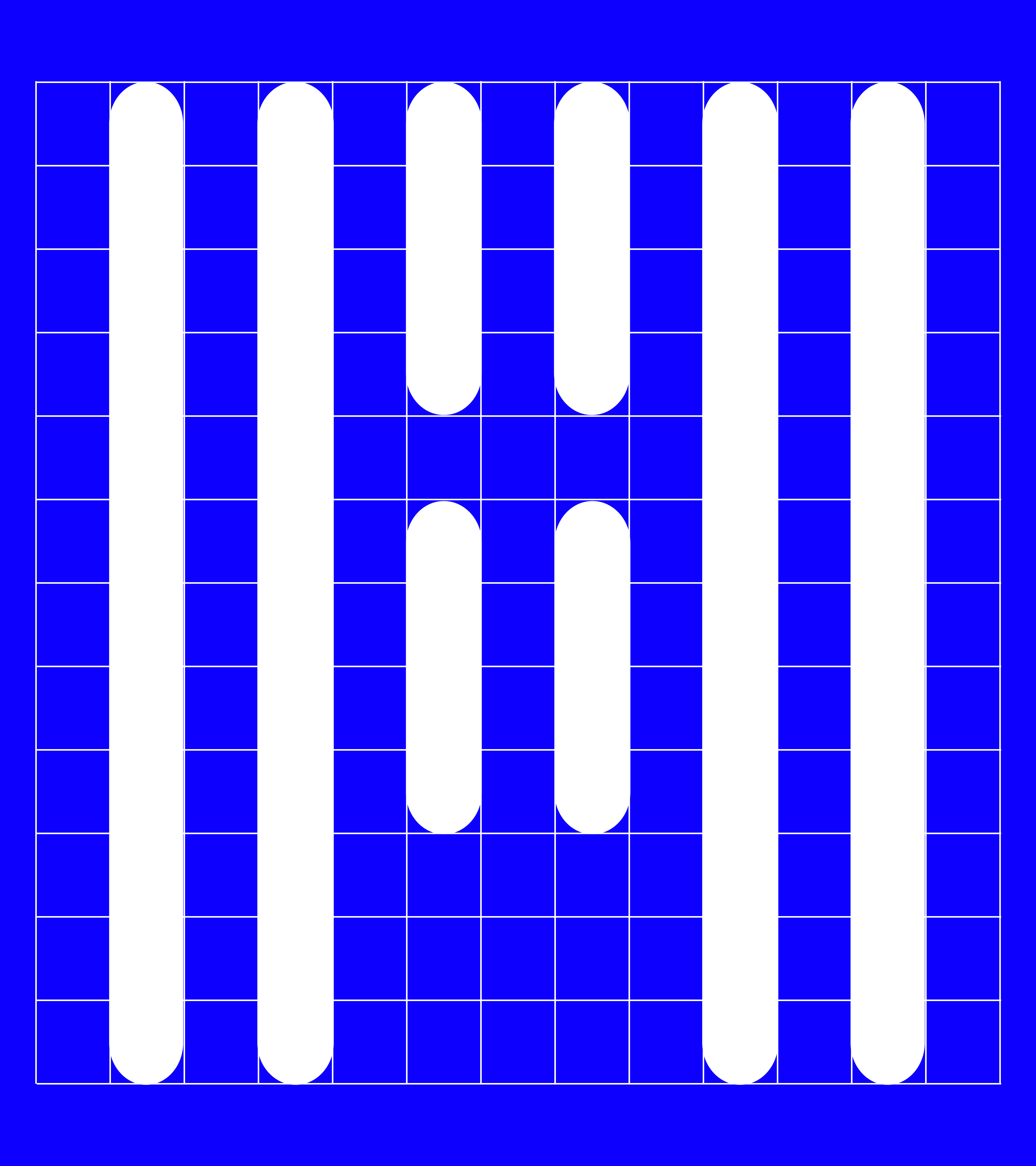


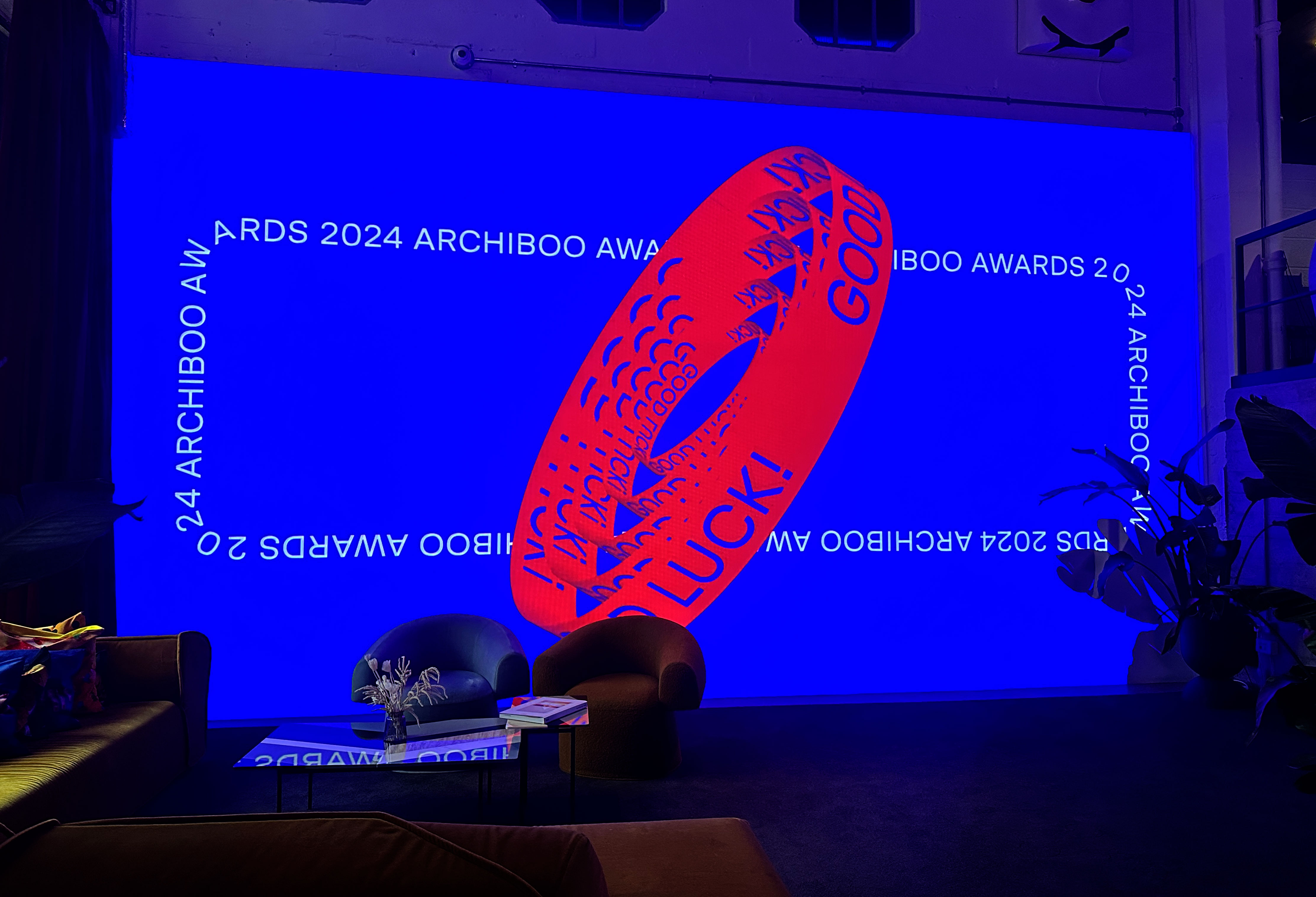


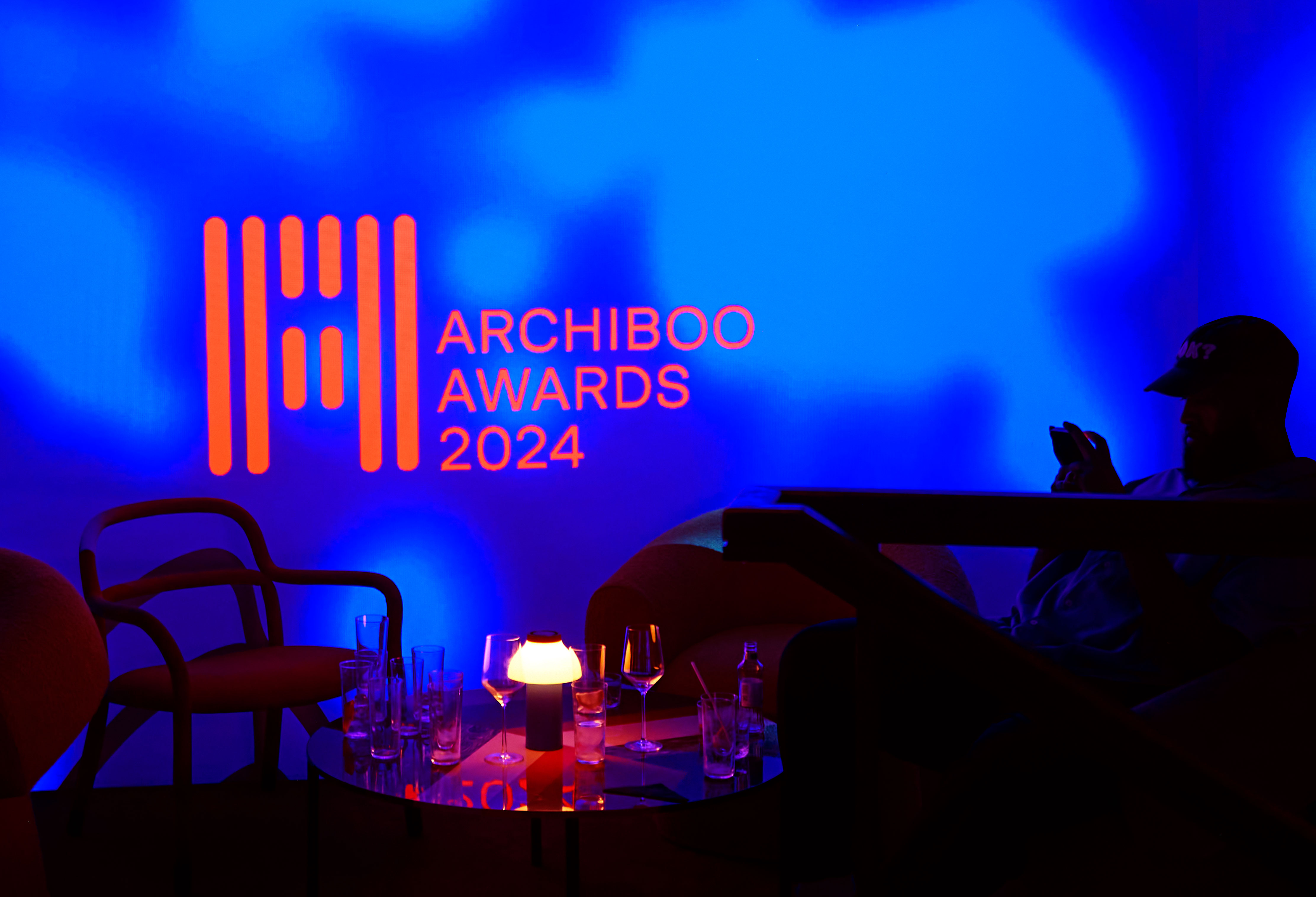
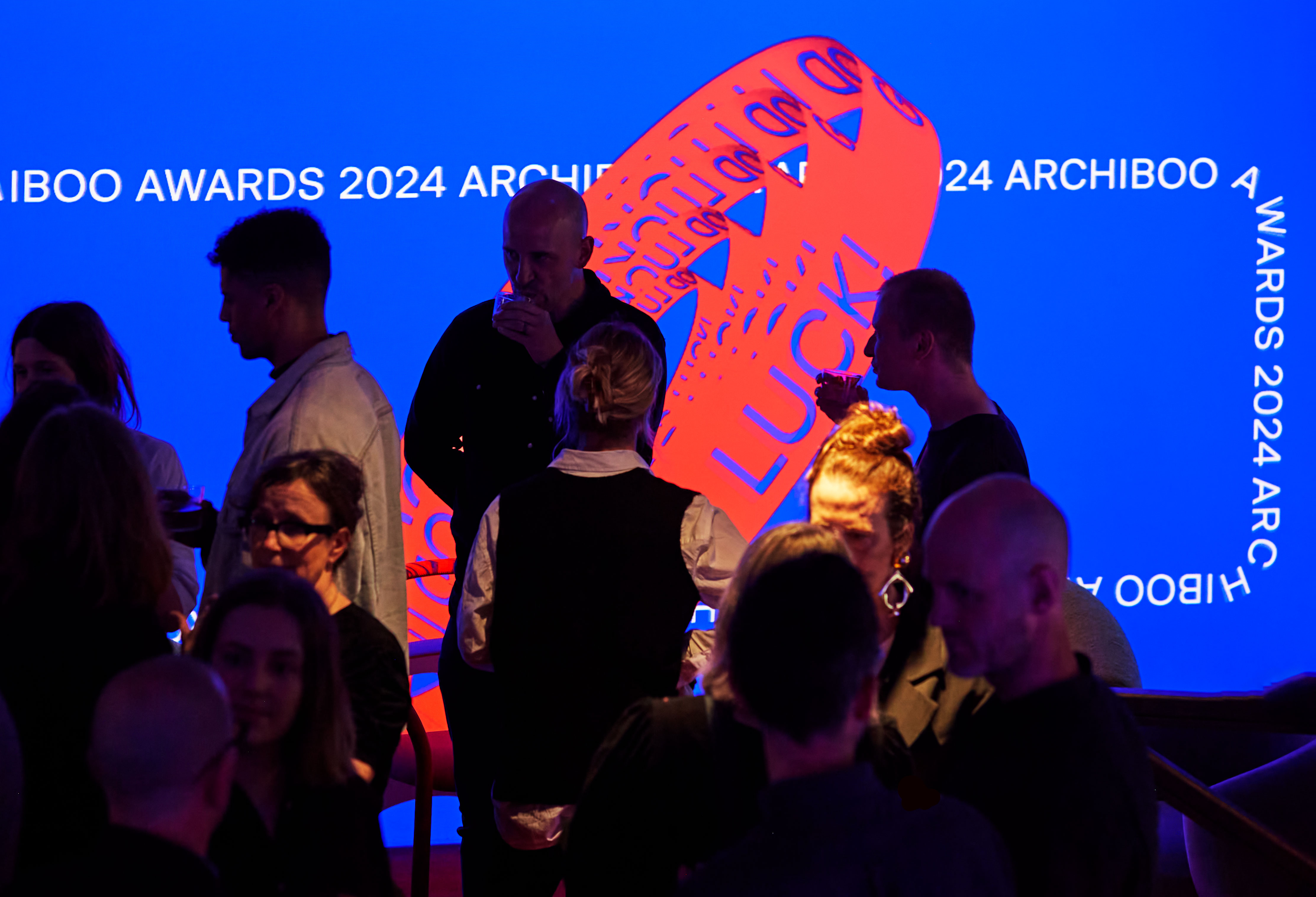
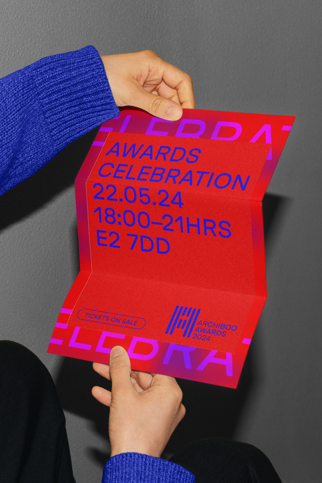
The Awards graphic langauge moved away from the previous iconography and now features typographic treatment, presented in both lowercase and title case. This newfound flexibility empowered us to amplify the impact, enriched further by vibrant colour contrasts. With typography and colour leading the charge, we established a dynamic and intuitive system for organic growth. Anchored in the parent brand, our design ensures immediate recognition and paves the way for expansion into new creative sectors.